"Our vision is to mobilize the might of India's brightest minds to create catalytic social change." – IIMAction
BRANDING
VISUAL LANGUAGE
WEBSITE DESIGN
Founded by IIM Ahmedabad alumni, IIMAction is a non-profit dedicated to addressing the lasting effects of COVID-19 in healthcare, education, and livelihoods. They approached us with the need to craft a brand that could reflect the depth of their mission and inspire meaningful engagement.
As we explored their ecosystem, we discovered a powerful network of individuals, volunteers, and communities deeply committed to rebuilding and uplifting lives. This collective isn't just active—they're passionate, resilient, and ready to drive impact. Our branding journey with IIMAction is about capturing this spirit and creating a visual identity that empowers their movement to grow and thrive.


"The Electro team thoroughly enjoyed the partnership and collaboration with the BASIC team. From the beginning they felt like an extension of our team and trusted partners. They quickly absorbed all of the onboarding documentation, asked smart questions, and felt like they were right up to speed with the rest of us in no time."
– Brock Weaver
Group Project Manager

IIMAction
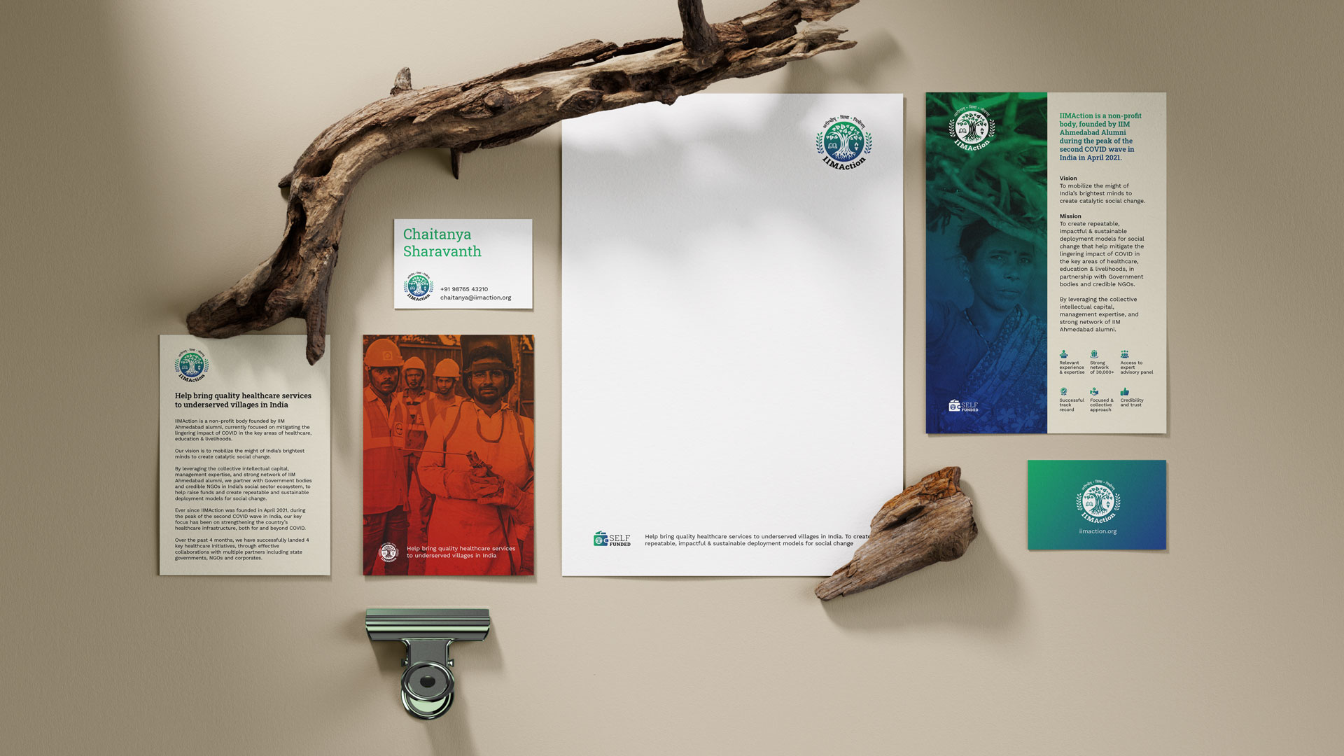
At the heart of the IIMAction brand lies a commitment to catalyzing grassroots change through purposeful design. Drawing from the legacy and credibility of IIM Ahmedabad alumni, our branding strategy centers on trust, clarity, and impact. The visual identity is rooted in the themes of healthcare, education, and livelihoods—represented through a harmonious palette of greens and blues that evoke growth, stability, and resilience. The logo—an emblematic tree supported by icons of knowledge, healing, and empowerment—serves as a timeless symbol of collective action and hope. Every design element is intentional, speaking directly to the values of social change, transparency, and collaboration.


Strategy
We extended the brand across stationery, digital assets, and community-facing communication to maintain consistency and purpose. The use of organic textures, documentary-style imagery, and localized messaging ensures emotional relevance and contextual appeal. Typography choices reflect approachability and professionalism, balancing the non-profit’s grassroots initiatives with its intellectual pedigree. Each touchpoint—from business cards to brochures—reinforces IIMAction’s role as a catalyst for scalable, sustainable impact in underserved communities. The branding doesn't just represent an organization; it tells a story of action, legacy, and future-forward purpose.


IIMAction’s intersecting brand strategy
We blended IIM’s legacy with bold, action-driven design. The visual identity merges professional minimalism with startup agility, using sharp typography and dynamic motifs to evoke momentum. Targeting ambitious students and leaders, it projects clarity, innovation, and impact across digital and physical touchpoints. Modular logos and kinetic visuals ensure consistency and flexibility. The brand voice is confident and clear—where vision meets action.


